用图片作为按钮是很常见的事,听上去是意见再简单不过的事,但是在 Qt 中使用有些需要注意的地方。
拉伸图片
图片尺寸和按钮尺寸一致,这是最理想的情况
1
2
3
4
5
6
7
8
| #button1 {
border: none;
min-width: 73px;
max-width: 73px;
min-height: 73px;
max-height: 73px;
background: red url(":/test.png") no-repeat;
}
|
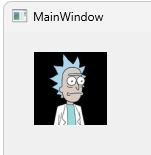
如图所示,按钮的红色背景没有显示,图片完美覆盖了按钮。
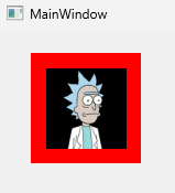
如果按钮大于图片时就会露出按钮的背景色。
1
2
3
4
5
6
7
8
| #button1 {
border: none;
min-width: 100px;
max-width: 100px;
min-height: 100px;
max-height: 100px;
background: red url(":/test.png") no-repeat center;
}
|
聪明的你可能会想到将按钮背景色设置为透明,这样看上去图片似乎正好是按钮的大小,这样视觉上是糊弄过去了,但是在用户点击图片四周空白时会触发按钮的事件,所以这种方式并不完美。
在 CSS 中有background-size可以拉伸图片,但遗憾的是QSS不支持设置background-size属性。
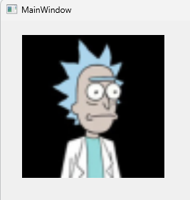
好消息是,我们可以用 border-image 来拉伸图片以便填充整个控件
1
2
3
4
5
6
7
| #button1 {
min-width: 200px;
max-width: 200px;
min-height: 200px;
max-height: 200px;
border-image: url(":/test.png");
}
|
禁用的按钮
用图片做按钮还面临着一个问题:按钮禁用后外观不会变化,看不到灰色。
标准解决方法是做两张按钮,然后通过伪类:disabled实现图片切换
1
2
3
4
5
6
| QPushButton {
border-image: url(:/images/button_normal.png);
}
QPushButton:disabled {
border-image: url(:/images/button_disabled.png);
}
|
但是,有时候因为各种原因只能用一张图片,比如图片是网路上找的,没有其他状态的图片。又或者按钮有多种状态,每种状态都要做一张灰色图也太费劲了。
那么如何解决这个问题呢?
答案是用icon属性来设置图片:
1
2
3
4
5
6
7
8
9
10
11
12
13
14
15
16
17
18
19
20
21
22
| QPushButton {
background-color: red;
border: none;
}
#button1 {
min-width: 100px;
max-width: 100px;
min-height: 100px;
max-height: 100px;
qproperty-icon: url(":/test.png");
qproperty-iconSize: 100px;
}
#button2 {
min-width: 30px;
max-width: 30px;
min-height: 30px;
max-height: 30px;
qproperty-icon: url(":/test.png");
qproperty-iconSize: 30px;
}
|
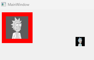
从图中可以看出,通过icon属性设置的图片可以缩小,但是无法放大。
最后请求 AI 帮助,给出了用自绘的方案,从 QPushButton 继承,并自己实现 PaintEvent 方法:
1
2
3
4
5
6
7
8
9
10
11
12
13
14
15
16
17
18
19
20
21
22
23
24
25
26
27
28
29
30
31
32
33
34
35
36
37
38
39
40
| void ImageButton::paintEvent(QPaintEvent *event)
{
Q_UNUSED(event);
QStylePainter painter(this);
QStyleOptionButton option;
initStyleOption(&option);
painter.drawPrimitive(QStyle::PE_PanelButtonCommand, option);
QIcon currentIcon = icon();
if (!currentIcon.isNull()) {
const QSize currentIconSize = iconSize();
QIcon::Mode iconMode = isEnabled() ? QIcon::Normal : QIcon::Disabled;
QPixmap pixmap = currentIcon.pixmap(currentIconSize, iconMode);
QRect iconRect = QStyle::alignedRect(
Qt::LeftToRight,
Qt::AlignCenter,
currentIconSize,
this->rect()
);
painter.drawPixmap(iconRect, pixmap);
}
int alignment = option.state & Qt::AlignAbsolute;
painter.drawText(this->rect(), alignment, option.text);
}
|
这回可以放大了,完美了
相关阅读
Qt Style Sheets Reference